Leafy Villa – Page 1 of 3
This Photoshop tutorial goes through the steps to design the Leafy Villa web page layout. It relies heavily on brushes and the Rounded Rectangle Tool.

1 – The basic website layout
Click File > New, set the height to about 600px, and the width to about 750px.
 Fill your background with black.
On the View menu, click Show > Grid, Snap, and Snap To > Grid.
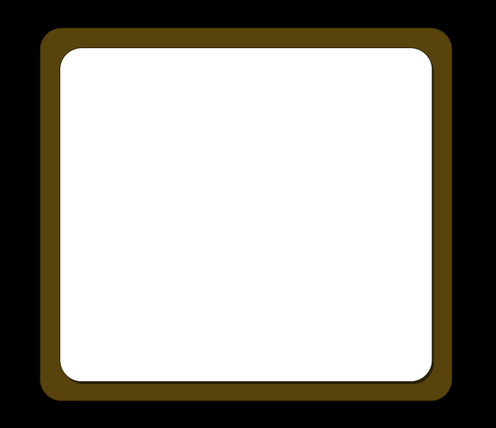
 Set your foreground colour to a brown colour (I've used 57430B). Choose the Rounded Rectangle Tool, (it shares a spot on the Toolbar with various other shapes.) Set the Radius to 30, and make sure the Shape Layers icon at the top left of the screen is selected. Draw a large brown box, as shown, then set your foreground colour to white, and draw a smaller box inside it.
In the Layers window, right-click on the layer of your white box, and click Blending Options. Give the layer a Drop Shadow (Blend Mode: Normal, Opacity 50%, Size 0. Leave all other options as default.) This creates a solid-looking shadow, which fits the non-realistic colour scheme of this website design. Also give it a Stroke (Size: 1, Opacity 50%.)

2 – Adding a website header and a menu
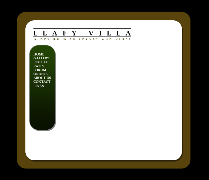
 Add in a dark green (I used 162B02) menu bar, the same way you added the white and brown areas.
Go back to the View menu, and turn off Grid and Snap.
Right-click your white layer, and click Copy Layer Style. Right-click on your new green layer, and click Paste Layer Style. Then right-click on your green layer again, and choose Blending Options, and add a Gradient Overlay (Mode: Overlay, Opacity 62%.)
 Use the Type Tool to type in a header. Use the Character window (Window > Character) to change text styles. I used Palatino Linotype and Century Gothic fonts here, in black, and the same brown as before. To create the lines, I just typed in a line of spaces above Leafy Villa, and then gave it an underline. In the Character window, I also increased the Tracking (letter spacing) of the larger text to 700. (Don't increase the Tracking of the last letter on the line, or it will extend the underline.)
 Use the Type Tool to put in white text on your green menu. I've used Palatino Linotype here again. Shrink your text size down so that your longest line fits well within the menu area.

3 – Creating a "pair of leaves" Photoshop brush
Click File > New, and create an image about 400px wide, by 200px tall.
Set your foreground colour to black.
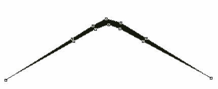
 Click on the Pen Tool. (Make sure you choose the Pen Tool, not the Freeform Pen, or anything else. They all share a button.) With Shape Layers still selected at the top left, click the Pen tool, to make a shape as shown. If you like, you can just put in the middle points and end points first, and then click on the lines to add points afterwards.

4 – Creating a "pair of leaves" Photoshop brush
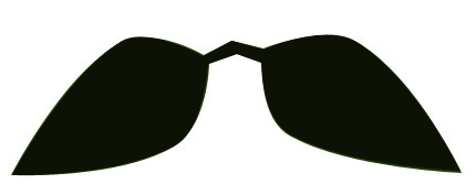
 Now hold Ctrl, and drag the points that are half-way up the arm away from each other, to create the shape shown. Press Enter when you're done.
Click Edit > Define Brush Preset, and give your new brush a name. (In Photoshop CS4, this option may not be visible. If not, choose a the Essentials workspace, right at the top-right of the screen.)


