A Touch of Class Web Design Tutorial – Page 1 of 2
If you'd like to design a site that's a bit more elegant than the standard business web design style, follow along with this tutorial.

1 – Making a bent selection
In Adobe Photoshop, make a new image. I'd recommend 775 x 600 pixels. (My example pictures are deliberately smaller, due to space constraints.)
Click on your background layer and press Ctrl+I, to invert it and make it black.
 Make a new layer.
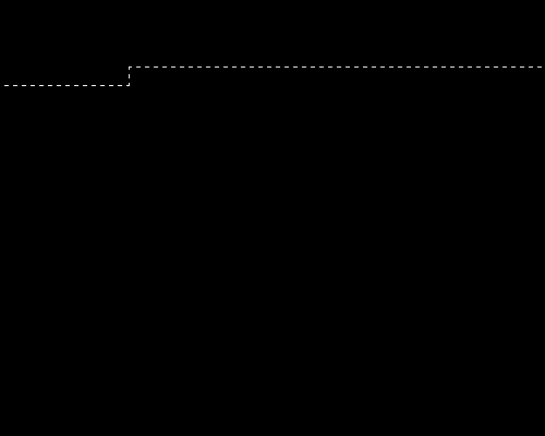
 Zoom right in (Ctrl +) and use the Selection Tool to select a crooked, one-pixel thick line, as shown. You'll need to do this in three parts. (Start by making a selection one pixel tall, and about 200 pixels wide. Then add another selection, this tme one pixel wide, and about 20 pixels tall. Then the final selection, one pixel tall, and several hundred wide.)
Remember—hold down Shift to add to your selection.


2 – Gold and grey Lines
As you may already know, most realistic gold effects are a combination of two colours—brown and yellow. Drag this little image into Photoshop so you can get the exact colours from it.
 Select the Brush Tool, and choose a diffuse 45-sized brush.
 Brush the whole selected area with brown. Then dab with yellow, then brown, then yellow. With such a thin selection, the "marching ants" selection line will cover it and make it impossible to see what you're doing. Use your imagination. :)
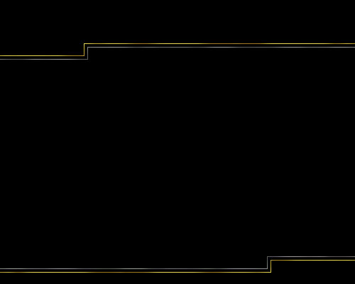
 Choose the Selection Tool again. Nudge the selection down and right by five pixels. To do this, press the Down Arrow key five times, then the Right Arrow key five times. Use the Selection tool to extend the selection to the left, so it touches the edge of the image.
 Brush the selected area with light and dark grey as you did with the yellow and brown. Then deselect the area (Press Ctrl+D.)
 Duplicate the layer, by dragging it onto the New Layer icon.
To create the bottom set of lines, Click Edit > Transform > Rotate 180°
 Use the Move Tool to move the layer down.

3 – Selecting a picture order
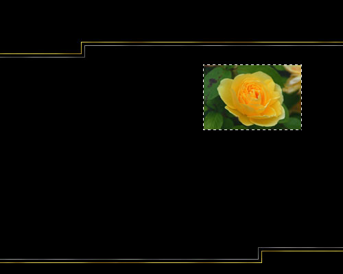
Find a nice image that represents a page of your site. If there's no image that represents "Home" on your site, just scour the net for a nice picture of a house. There's no need to be exact.
To shrink the image, Click Image > Image Size. Make all your images the same size this way.
 Using the Move Tool, drag the image into your main file.
In the layers list, Hold Ctrl and click on the layer of your picture, to select that area.
 Zoom right in and deselect all but a one-pixel border. (Alt+Drag deselects an area.) It's delicate work. Do it in stages if you like. Don't use any of the "Modify Selection" options. These will give you an anti-aliased (fuzzy and smooth edges) selection, which will fuzz up the whole selection, because it's so thin.
 Make a new layer.
 Brush the area with yellow and brown, as before.

4 – Giving the Picture a Double Border
The next step is to make the bigger grey border that goes around the gold one. Click the eyeball next to your picture layer to hide it if it gets in the way.
 Make a new layer.
The gold border should still be selected. Nudge the selection up and left five pixels, by pressing the Up Arrow key and Left Arrow key five times each.
 With the Paint Bucket Tool, fill the area with any colour (I've used white.)
Nudge the selection ten pixels to the right, by pressing Shift + Right Arrow. (Shift makes the object move ten pixels at a time.)
 Fill the area with the Paint Bucket again.
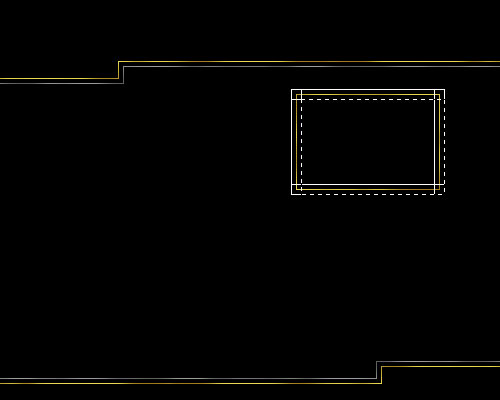
Keep filling and nudging the selection around, until you get a larger rectangle, like the shape shown in white in the diagram.
 Zoom right in and use the Selection Tool and the Delete key to remove all but the outermost line.
Ctrl+Click this layer in the layers list to select it.
 Brush the area with the greys as before.


