
Roll Over Buttons
This tutorial demonstrates how to use Nudge and Inner Shadow to give a button that pressed-down look while the mouse cursor is over it.
1 – Adding a background for the button
 Create a new layer.
 Fill the area with a brownish, peachy colour. The best way to find this colour is to click on the colour blocks on the toolbox, to bring up the Color Picker. Move the slider down to red, and then click in the middle of the colour box.
To add a simple wood finish, click Filter > Noise > Add Noise. Set it to 6%, Gaussian, Monochromatic, and press OK.
Click Filter > Blur > Motion Blur, and set the Distance to about 10 pixels. Press OK.
To create the gradient effect, right-click the layer, and select Blending Options. Click Gradient Overlay. Change its Blend Mode to Overlay, and its Opacity to 50%. If the Gradient isn't black-white, click on the little gradient bar, and choose the Black-White gradient. Then press OK.
Optional: you can use the Hue/Saturation (Ctrl+U) and Brightness/Contrast sliders to play around with the colours a bit more if you like.
2 – Creating the button shape
In the Channels window, make a new layer. If the Channels window isn't visible, click Window > Channels.
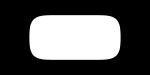
 Choose the Selection Tool, and select a rectangle in the centre of the area.
Fill the area with white, and press Ctrl+D to deselect the area.
Click Filter > Blur > Gaussian Blur, and set the Radius to about 8 pixels.
To re-condense the blurred area, press Ctrl+L to bring up the Levels window. There should be three arrows beneath the main window. Drag the left and right arrows in, so that they're very close to the central arrow.
In the Channels window, Ctrl+Click the "Alpha" layer, to select its outline.
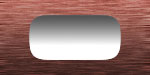
3 – Filling the button with a Gradient
Go back to the Layers window, and create a new layer.
 Choose the Gradient Tool. (Remember that it might be hidden under the Paint Bucket Tool.) Apply a gradient from the bottom of the image to the top.
Running your gradients in opposite directions like this increases the image's contrast, and helps to make it look more realistic.
You can deselect now. (Press Ctrl+D)
To lighten the gradient, click Image > Adjustments > Brightness/Contrast, and increase the Brightness to +80.
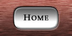
4 – Adding some effects and text
Right-click your button layer, and choose Bevel and Emboss. Set the Style to "Pillow Emboss", and the Technique to "Chisel Hard". Next, choose Stroke, set the Size to 1, and change the colour to black.
 Use the Text Tool to put some text on your button. I've used Palatino Linotype, bold, here. If you're using all capital letters, make the first letter slightly bigger.
Click File > Save for Web, and save the image as a Quality 60 Jpeg.
This image is your "normal", unpressed button.
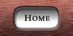
5 – Creating the pushed-down effect
To make a realistic mouseover button, you'll need to move the text slightly, and give the button an Inner Shadow. These two effects combine to give a realistic pushed-down feel.
To add the Inner Shadow, go back to your button layer, and right click it. Select the "Inner Shadow" option, and then press OK.
 To make the text move, click on your text layer, and choose the Move Tool. Press the Down Arrow key, then the Right Arrow key.
Click File > Save for Web, and save the image as a Quality 60 Jpeg. Give it a different name to the image you saved in the previous step.
This image is your pressed button.
(Mouse over me)
6 – Making the rollover effect in your web editor
In Frontpage, insert the "normal" version of your button, just like you would any other picture. Click on it, and click Dynamic HTML effects. Follow the prompts through, and when it asks you to select another image, choose your "pressed" button image.
In Dreamweaver MX, on the Common bar, click the Image icon, and choose "Rollover Image". Put the two images you've made as the Original Image and the Rollover Image.
In other web page editors, just look for Rollover Image on the menus.