Navigation Structures
Ever visited a site and wondered "what am I supposed to do?"
Ever got lost in someone else's tangled web?
Often, people will create a site loaded with information, and present it in such a way that you have to work the site out before you can do anything with it. While it's necessary to organise your information into a logical structure, remember that people find it hard to comprehend anything but the most simple and obvious structures. You may say "Well, it's pretty obvious isn't it", but that's only because you know your site so well.
Often, I've wandered aimlessly through sites, not knowing how many levels there are to it or how much information there is "out there somewhere" on the site, and without any idea of what I've missed or whether I "took the right turn".
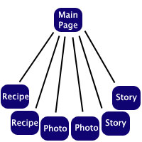
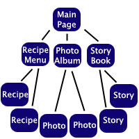
In this example, I've created a hierarchy that organises a site with recipes, photos and stories. Each of these options is very commonly used on the web, and with any option, the items are all accessible, but what's the best way to organise those items?
 |
 |
 |
| One-Tier Site:
All the information is on one page. |
Two-Tier Site:
On the main page, there is a link to each of the six items.
|
Three-Tier Site:
On the main page, there is a link to a page for each category. These pages may have thumbnails or brief descriptions on them, and have links to the items in that category. |
The advantage of a one-tier site is that there are no internal links, and there is no navigation. Everything is right there on that page. This is perfect for sites that have very little information on them, but if you have a site that's not minuscule, this would just create a totally disorganised "Wall of Text".
The two-tier site allows for a fair bit more information, but if you have a large site, it will confront the visitor with an unsightly "Wall of Links".
This site is a three-tier site. I chose that format when I created the site, as it works well. I have a main page, and then you can choose tutorials, articles, resources etc. and then you choose the specific tutorial, article or resource you want. The only problem is that you can't see the third tier from the first page. I sometimes can't remember whether something's a tutorial or an article, and visitors have to choose whether they want a tutorial or a resource without knowing anything about what they will find.
When I get around to redesigning this site, I'll to organise it with a Top-Heavy combined three-tier system, explained below.

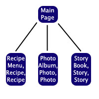
Bottom-Heavy System: This system combines the second and third tiers, with a link to each category on the main page, and multiple items (e.g. stories) on one page. This is perfect for if you have lots of categories, but with not much content in each category. If I tried to set Pegaweb up like this, every tutorial would be on a single "Tutorial Page". It would be about 800k, and about ten miles high. :)

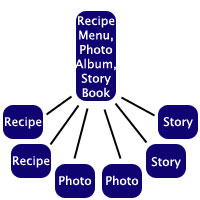
Top-Heavy System:
As long as this doesn't create mass clutter on your main page, this option has all the advantages of two and three tier systems.
The links to each item are on the main page, but are organised into tiers on that page. There will be a fair few links on the main page, but the organisation of the site will be very easy to understand.
This is the system I intend to use when I redesign this site. On the main page, there will be tiers, with links to each individual tutorial, article or resource etc. If you look back up the page, you'll find that this system is very similar to the two-tier system - in effect, it IS a two-tier system.
The moral of the story is - design your websites to be two-tiered. Choose the bottom-heavy or top-heavy systems as necessary. Unless your site is gigantic, it's possible to keep your site two-tiered, especially by using the bottom-heavy system and creating/removing categories, to balance the clutter between your main page and the rest of the site.


