


Adsense Experiments: The Best Adsense Placement
Continuing on from the previous point, I though to myself "what's the limit of this addition of extra ads?"
5 – Going to the extremes
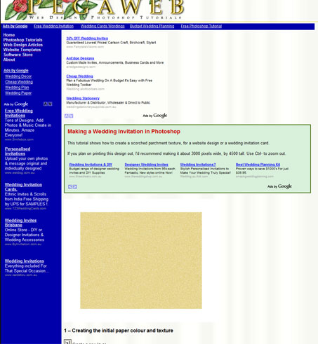
This is my Wedding Invitation tutorial. I chose this page for the experiment, as it had a reasonable number of visitors.
See if you can spot the five different ads on this page. (The sixth is a LU at the bottom of the page.)
I used the coloured box from a previous experiment, and made a "faux navbar" out of a LU. The real links were moved to the top of the new sidebar.
Here are some results, to give you an idea of how the experiment went.
| Channel | CTR |
|---|---|
| Tuts/Wedding/1-LU Navbar | 3.06% |
| Tuts/Wedding/2-LR Above intro | 1.41% |
| Tuts/Wedding/3-LU Menu | 0.71% |
| Tuts/Wedding/4-WS Menu | 1.03% |
| Tuts/Wedding/5-LB Intro box | 0.89% |
| Tuts/Wedding/6-LU Footer | 1.18% |
(These values are illustrative only.)
The real values added up to a fairly high CTR. It was slightly higher than my current LR-Intro-LR setup for that page. However, the amount I was getting per click was significantly lower than usual. All the extra ads were letting in the low bidders (like Adwords bids of one cent), in addition to the presence of so many LU's. (Note that the highest-CTR ad is a LU.)
There's also the fact that this layout's strength is its spamminess and deceptiveness. This setup would surely put off lots of visitors, and cost me clicks on other pages. It also looks terrible.
All attempts at making a reasonable version of this layout were failures. Without any shenanigans persuading them otherwise, people will just skip big chunks of ads with no content between them.
Two ads is optimal for your introduction. (One above and one below.)
6 – Colours and Borders
I've tried various colour scheme alterations. I've changed the link text from normal blue to navy (darker) blue, and to black. I've made bright pink ads that stand out on the page as much as possible. I've made the ads match the colour scheme of my site header, with red link text, and green URL's. I've tried all the various border options.None of it works. In fact it usually fails spectacularly. Even the small changes do non-trivial damage to CTR.
All you need to know is that the ad background colour should match your page background colour, and that the borders should be invisible (i.e. because they're also that colour.) Leave everything else as it is.
7 – List of miscellaneous advice and information
- Entry pages (i.e. those that people likely visit first, when coming to your site) will have much higher CTR's. Visitors to those pages are likely to be specifically interested in that page, and are more likely to click the links. (Visitors from other parts of your site are just likely to be browsing, after coming in to the site via another topic.)
- Affiliate links will hurt the CTR of your Google ads. However, good (and relevant) affiliate links will often make much more than Adsense, and they can be used much less intrusively. I find a sole affiliate link near the top of an article will take about half its visitors from people who otherwise would've clicked the nearby Adsense ads. (It's still clearly worth using affiliate programs though.)
- Split articles into multiple pages. Each page can have three ads of its own. (I find that the second page of an article/tutorial will retain about 50% of the visitors of the first page.) Also, the Google search engine will pick up each page. Long pages can also be unwieldy and sometimes slow to load.
- Make a new channel for each ad.
- Run your own experiments.
- Run experiments on any pages with a reasonable amount of traffic. It will take less time to get statistically significant results.
- Most sites running Adsense have a CTR of 2-3% (5%+ is good), and earnings vary wildly, but average 10c per click.
Thank you for reading my learnings. :) I hope this information helps you improve your Adsense layout.